- May 6, 2024
Mastering Scrapbooking Design: Essential Design Tips You Need To Know
- 0 comments
While designing layouts can seem intimidating for new and seasoned scrapbookers, you don't need to be a professional designer to create beautiful pages. Some basic principles will help you get started. Let's explore them.
Balance
One of the first design principles to consider is balance. Balance refers to how elements are distributed and weighted on a scrapbook layout. You want to arrange the elements (photos, journaling, embellishments) in a way pleasing to the eye and your brain.
You can achieve balance in a few ways.
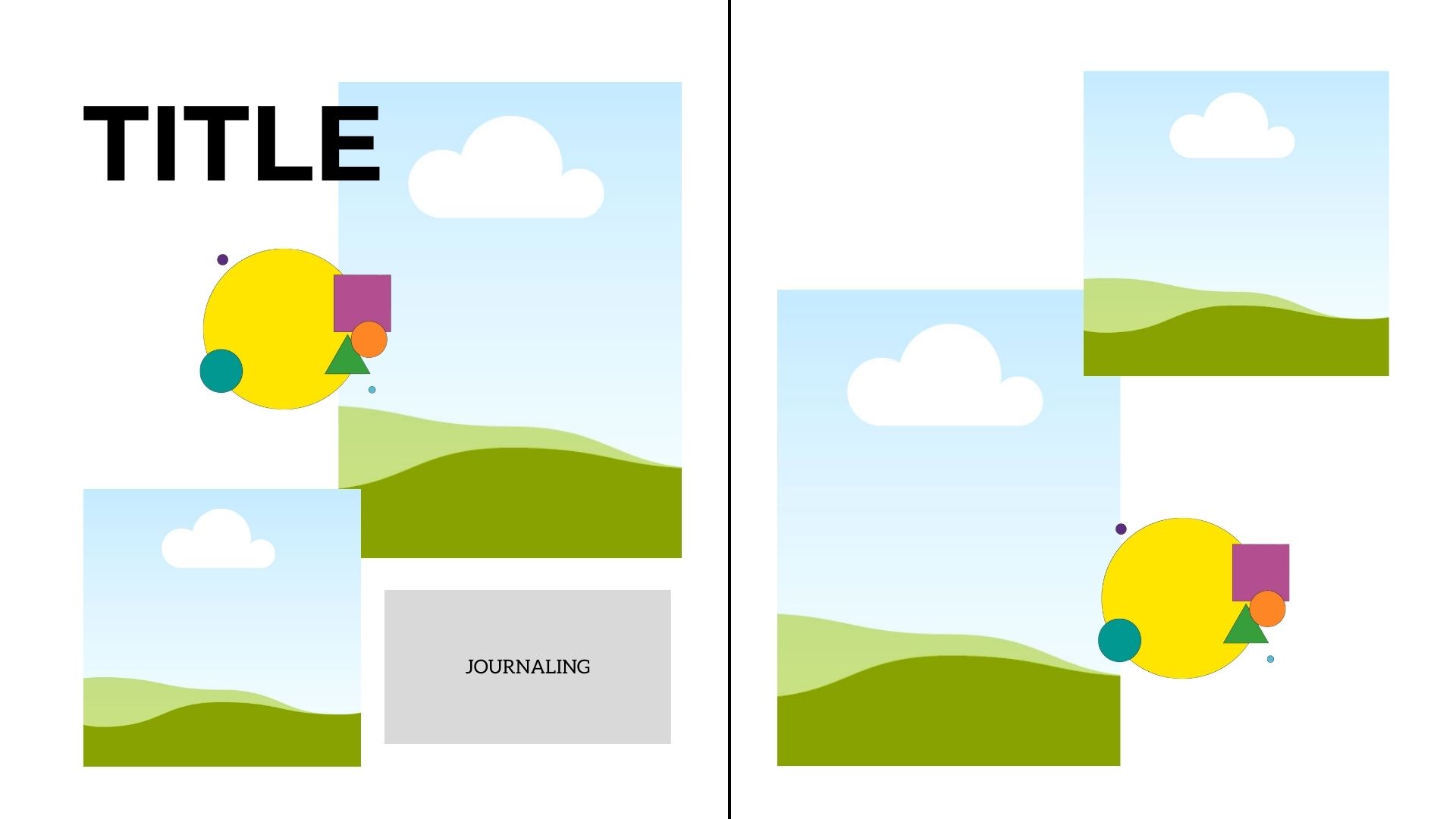
Symmetrical Layouts
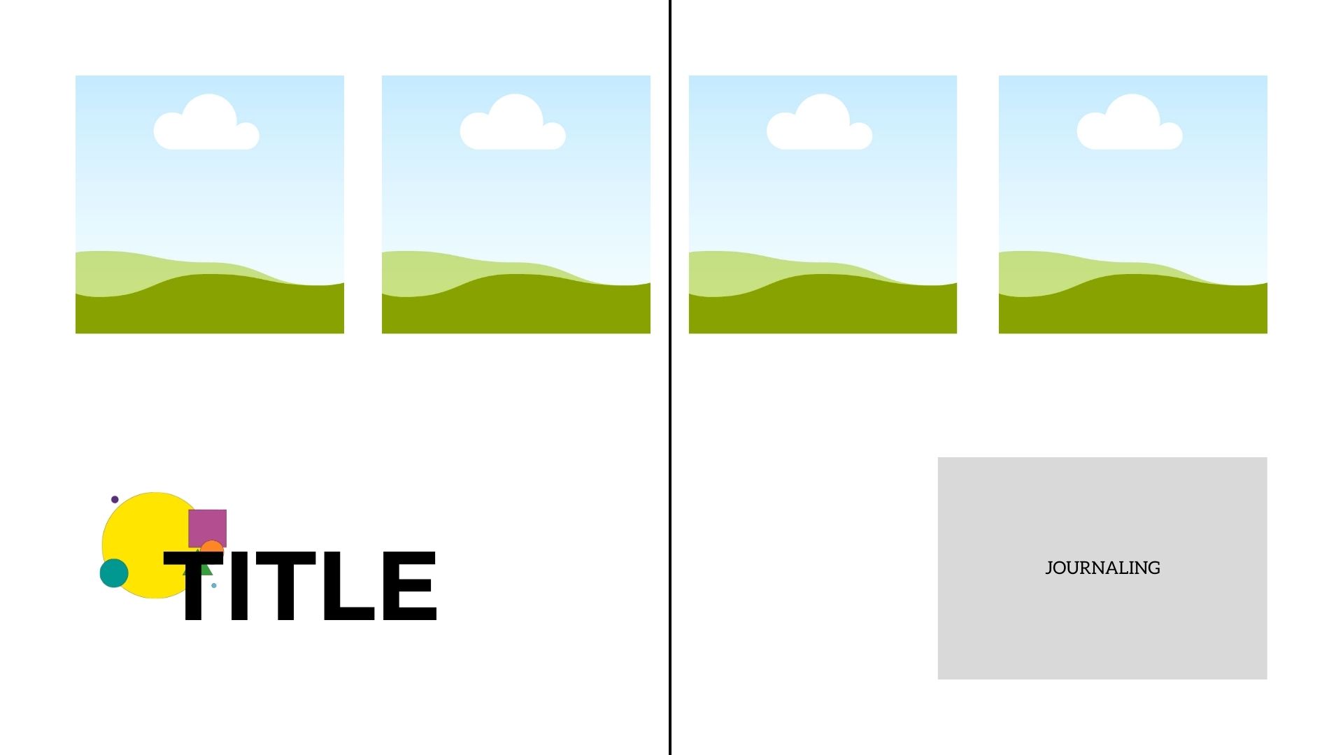
In symmetrical layouts, you create a mirror image on both sides of your layout. Elements on the left page are reflected on the right.
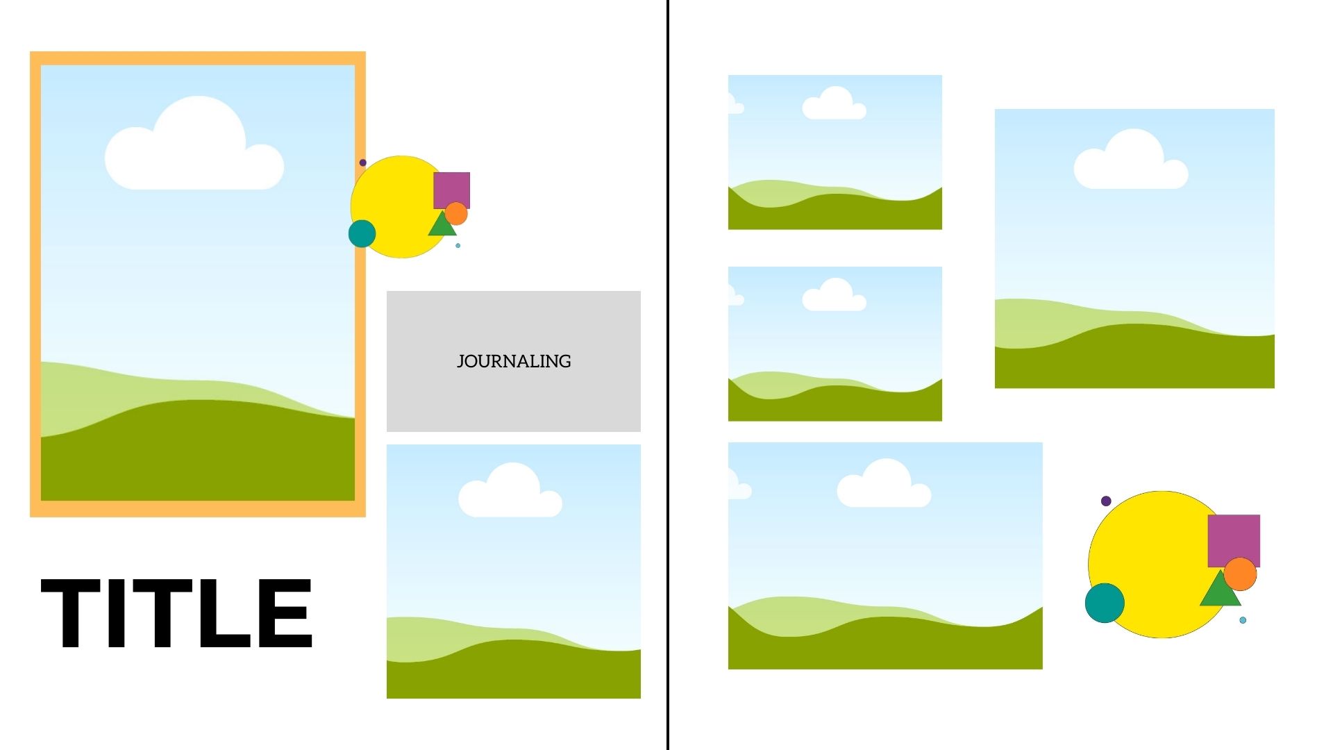
Asymmetrical Layouts
Asymmetry involves giving some elements on a layout more weight than others. For example, you may give your focal point photo the most visual weight on your design but balance out the weight of your focal point with supporting pictures and accents in varying sizes. Asymmetry is tricky, but it provides a more dynamic feel to your layouts than symmetrical ones.
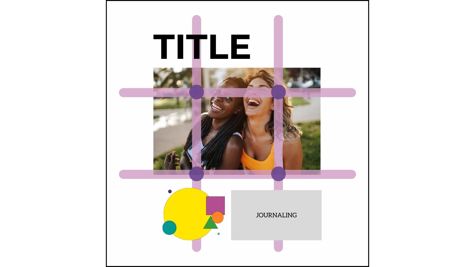
Rules of Thirds
Another trick to try is the Rule of Thirds. Think of a square or rectangle and divide it horizontally and vertically to create 9 spaces. You create balance in your layout by placing the most important elements where the lines intersect. These elements could include photos, embellishment clusters, titles, or journaling.
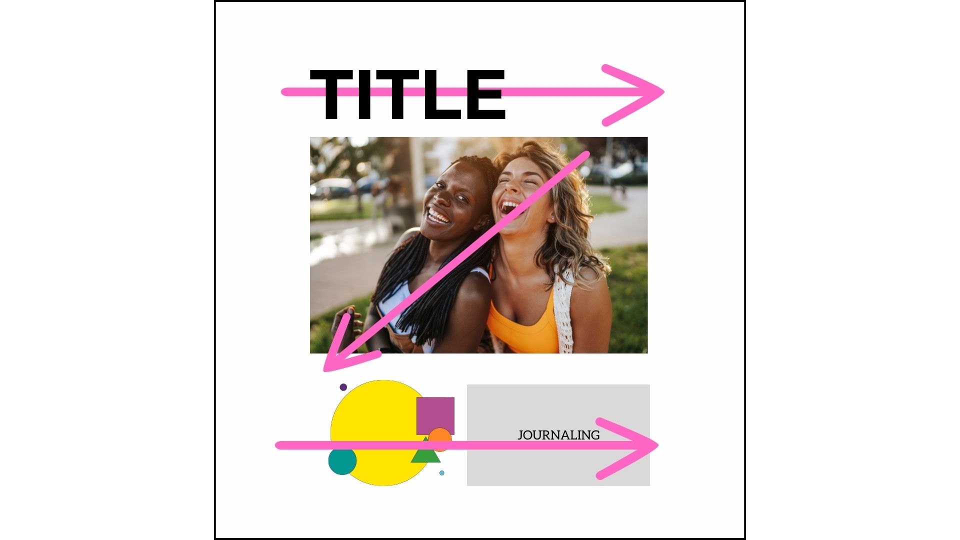
Z or Visual Triangle
Another design option is to arrange your page elements in a "Z" formation. Because the eye naturally wants to connect items on a page, you can place photos, journaling, or embellishments in this pattern to create a pleasing layout.
White Space
White space gives your eyes a place to rest on your layout. Instead of covering every inch of your page with something, leave part or parts of your page empty. This will give your page some breathing space and allow your photos and other elements to pop.
Color Theory
Colors can elevate your scrapbook pages. But how do you know what colors to use? Here are some things to consider as you select a color scheme.
Photos
The most straightforward approach is to use the colors in your photograph as a guide. Choose colors that complement your photos, not overwhelm them.
Mood
Consider the mood you're trying to convey on your page. Did you know there's symbolism associated with each color?
Red – passion, excitement
Orange – youth
Yellow – warmth
Green – life
Blue – soothing
Purple – exuberance
Pink – energetic
Color Combinations
If you want to know how best to combine colors, understanding the color wheel may help you choose the most appealing combinations to create a harmonious layout. Here are some typical color schemes:
Monochromatic - This is the most manageable color scheme, as it represents shades of a particular color.
Complementary - These colors are directly opposite each other on the color wheel.
Analogous - These are neighboring colors on the color wheel (green, blue-green, blue, blue-violet)
Split Complementary - Choose a main color and the colors on either side of its complement (blue, yellow-orange, red-orange)
Triadic - These are colors that are equal distance from one another on the color wheel (purple, green, orange)
You can get a color wheel at your local arts and crafts store or use an online version like Adobe Color to help you create coordinated combinations.
Proportion
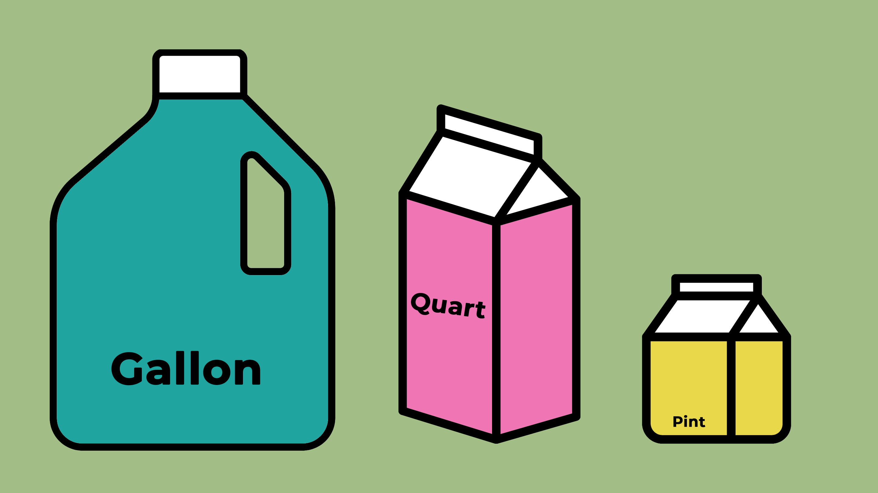
While playing with color is fun, you'll want to limit the number of colors you use on a layout. I adhere to the Gallon/Quart/Pint rule. The "gallon" is your main color. The "quart" is a secondary color; you don't use as much of it as you would the main color. The "pint" is an accent color. You only need to use a bit of it.
Typography
Typography also influences page layout design. Consider titles, journaling, and even captions to be essential design elements.
These are the basic typefaces you can use on your layouts:
Serif - fonts with little "tails" on them
-
Sans Serif - fonts without the tails on them; smooth and rounded
You can use serif and san serif for titles, journaling, captions, and phrases.
Script - these are great for titles, captions, or phrase accents
Display - These are best used for titles
Don't go font crazy. Try to limit the number of fonts on your page to no more than three. I also like to create contrast with my fonts. For example, use a serif title with sans serif journaling and vice versa. You can also experiment with font color and size to create exciting effects.
Whether they are stickers, die-cut letters, or computer-generated, make sure you use fonts that are visually appealing, readable, and complement your overall design.
Putting It All Together
Let’s apply these principles by designing a simple scrapbook page. This is a symmetrical layout with a split complementary color scheme (red, blue, yellow, teal).
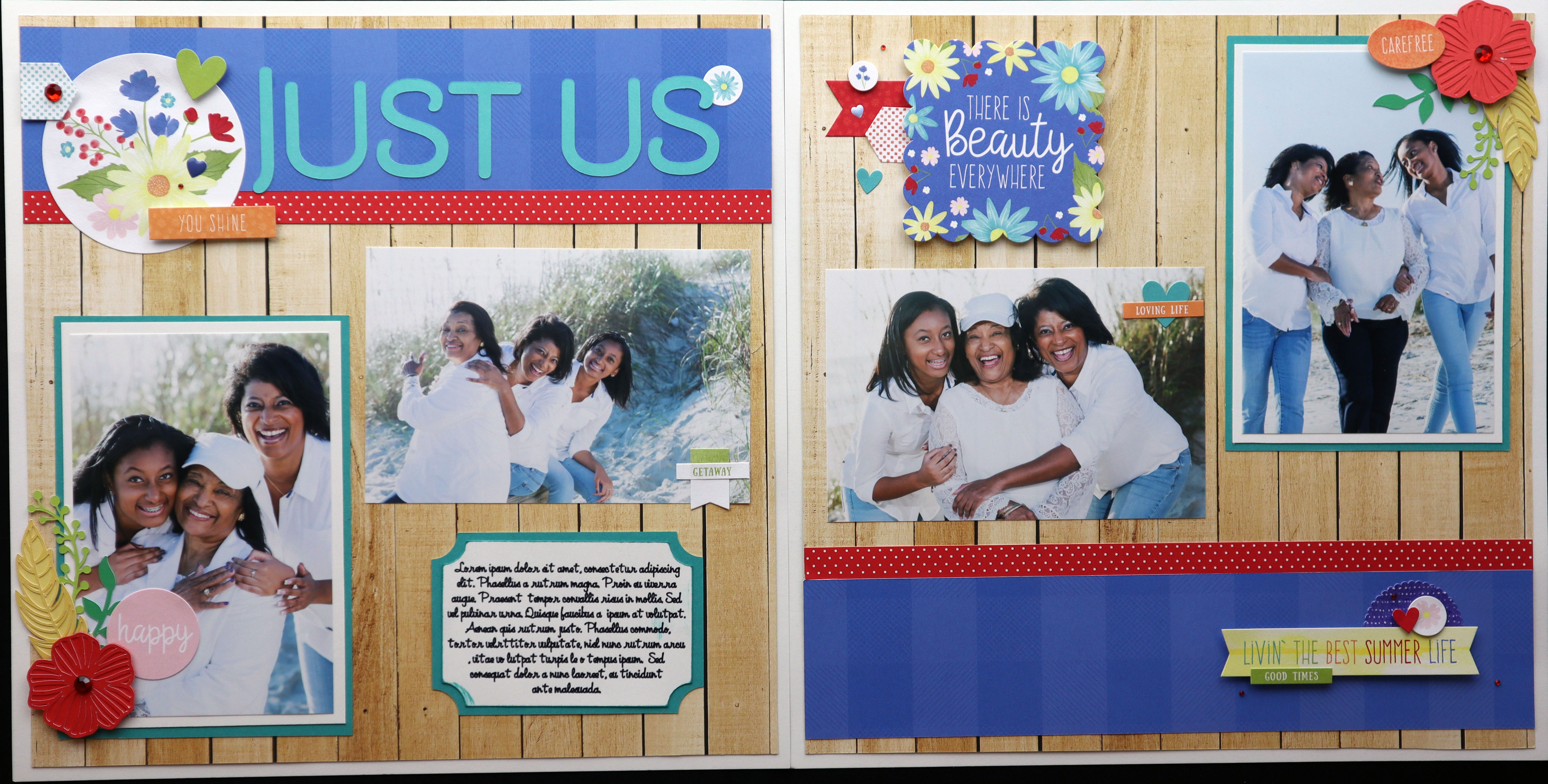
As you can see, using the principles of balance, color and typography along with a few design tricks can really help you create visually appealing scrapbook layouts. Put a few of these tips to the test by trying them on your own pages!
Learn More
My online class, "Scrapbooking 101: Getting Started," explores different layout styles and approaches that you can apply in three scrapbooking projects. Sign up today!